 Brand Guidelines
The Seven Tree Media
Brand System
Everything needed to build on-brand — colors, typography, logos, voice, and usage rules. Use this as the source of truth on every page, email, and asset we produce together.
Color Palette
Typography
Display & Headings
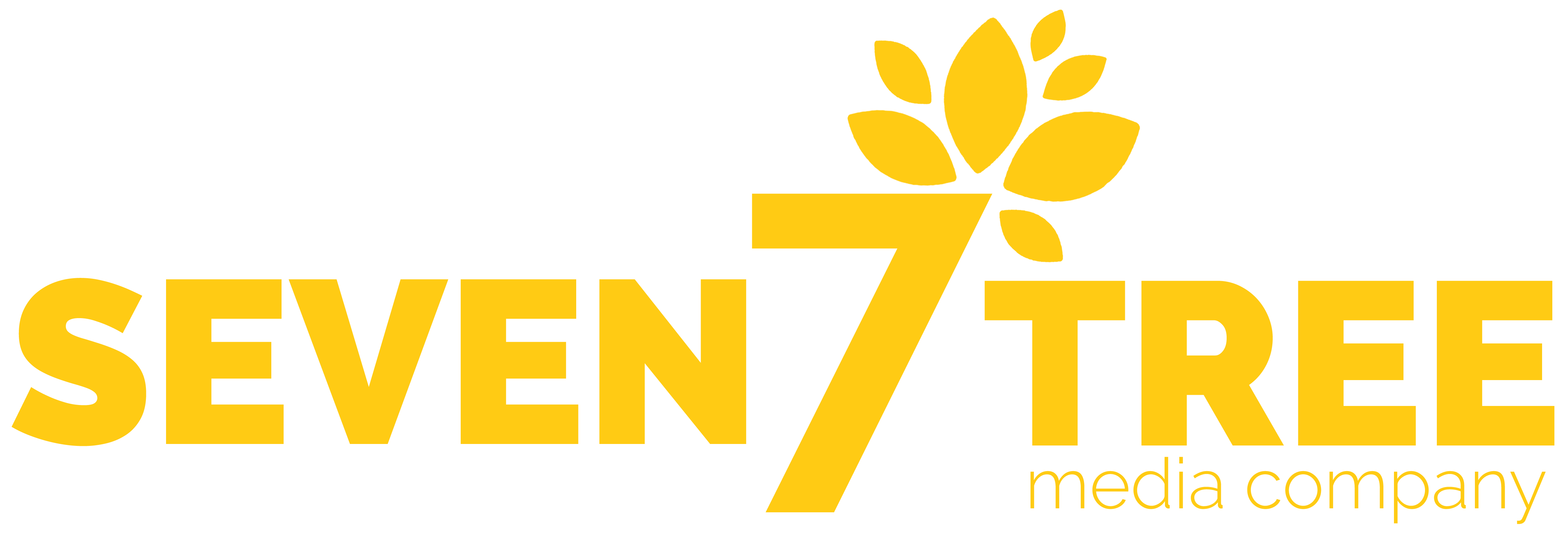
Logo System
Photography

Primary headshot — usage notes
seventreemedia.com/wp-content/uploads/2025/11/Devon-Jones-...Voice & Tone
Direct
Say the thing. No preamble, no build-up. The reader doesn't need to be warmed up before getting the point.
Plain-spoken
No jargon that hides meaning. If a simpler word works, use it. The goal is clarity, not cleverness.
Warm but not soft
Friendly and approachable without being a pushover. Devon challenges people's thinking. He doesn't coddle.
Philosophical at times
Connects big picture thinking to practical action. The reader should leave with a new way of seeing the problem.
Conversational
Contractions are fine. Sentence fragments are fine. Write the way Devon talks — confident and easy to follow.
Action-oriented
Ends on something useful. Not inspiration for its own sake — the reader should know what to do next.
Write this
- Short sentences that move forward
- "You're not short on ideas — you're short on structure."
- Concrete verbs: build, test, measure, design, close
- Questions that make the reader think
- Casual transitions: "Here's the thing...", "So what does that mean?"
- Grade 6 reading level — even for smart audiences
Never write this
- Leverage / unlock / empower / enable / optimize
- "In today's fast-paced business landscape..."
- Passive voice when active works fine
- "It is crucial to understand..."
- From X to Y sentence openers as rhetorical hooks
- Fake urgency or promotional phrasing
Brand in Action
You don't need more ideas.
You need a system that works.
I work with founders and teams who know where they want to go but keep hitting the same friction. I don't do the work for you. I build the system that makes the work obvious.
Quick-Reference Rules
Yellow on dark only
Never use #FFCB14 as text on a white or light background. It has poor contrast and reads as washed out.
Raleway for all headings
H1 through H4 are always Raleway, weight 700 or 800. Open Sans is for body copy and UI labels only.
Buttons always use !important
WordPress themes override button text color. Every .btn rule needs color with !important to hold.
All CSS scoped to #page-id
Every CSS rule must be scoped to the page wrapper ID to prevent theme and plugin conflicts.
No pure black or pure white
Use #1A1A1A instead of #000 and #F8F8F8 instead of #FFF. Pure values feel harsh on screen.
Eyebrows always uppercase
Section labels and eyebrow text use Raleway 700, 12px, letter-spacing .12em, all caps, yellow.
Borders stay at 0.5px
Card and container borders are always 0.5px solid with rgba white at low opacity. Never 1px solid white.
Two CTAs per hero max
Primary CTA in yellow, secondary as ghost/outline. Never more than two choices in any hero section.